All digital products are interactive systems. The system establishes many two-way communication points between different audiences that use the software. This means that the software must communicate a process that depends upon the actions of another person.
Real Time vs. Asynchronous Systems
Each of these interactions can be “real-time” in which two or more participants are all using the system at the same moment. With real time systems the software acts as transmitter and receiver of participant inputs. By contrast, individual interactions can be “asynchronous” where participants each interact without requiring the other party to be using the system at the same time. Most web products are “asynchronous” where as desktop and smartphone based systems are frequently “real-time”. Systems that are only real-time or only asynchronous are rare.
Your audience tells you when you are done
Understanding each audiences capacity to consume your digital product is incredibly important. Just because an interactive feature is possible doesn’t mean that the intended audience will prefer it, or even understand it. Beyond and more important than the ability to use the software is the emotional preference to use the software. Software competes for our attention and justifies it’s usefulness every time it’s used. All interactive software must be preferable than any other solution available.
Achieving an emotional response is essential
Where an interactive system does something that can easily be done another way, say allowing an audience to play a game, the emotional connection the system creates must be very intense. Where an interactive system does something that can only be done with that system, say buying something from a specific organization, the emotional connection should be subordinate to the relationship that the audience and that organization are participating in. These are just two examples, there are many more. Knowing when the emotional response is critically in play and when we can assume emotional engagement has already been established is tricky and subtle. Get it right and your digital product will feel intuitive and trustworthy. Get it wrong and your entire brand is at risk.
Ease of Use and Simplicity
Ease of use occurs when the software correctly predicts and achieves the ideal emotional tone and interactive features balance for each audience.
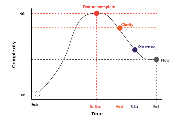
Digital products must achieve a feature complete solution, otherwise they just don’t work at all, but feature completeness is almost never enough to differentiate the product. Once feature completeness is achieved, designated by the red dot in the diagram, the system is refined. Subsequent sprints achieve clarity (the orange dot), structure (the blue dot) and ultimately flow (the green dot). The intended audiences is engaged as soon as feature complete systems are available. Direct feedback, through user experience testing with each audience is essential to ensure design decisions actually reduce complexity and achieve flow.
